One of the first things you might do when you’re redesigning your website is to think about your branding. Or maybe the pages you want. How you need new copy. Or photography. Or any number of new things.
But you’re wrong.
I’m sorry to say it, because I know sometimes as entrepreneurs we think new is better (or at least more exciting).
The first thing you need to do when redesigning your website is to look at your old website. More specifically, look at the analytics you were tracking on your site. (Not tracking your current site? Start here to see which codes you should install.)

Beyond the standard sessions, users, and conversions, analytics tells you a very powerful thing: how your audience behaves on your site.
And that, my friend, is invaluable information to have going into a redesign.
Who wouldn’t love to know exactly which pages were accomplishing their goals? Which pages were converting? Which pages were driving people away?
The pages that are making you money?
I know I want that information!
Open up Google Analytics (go ahead, I’ll still be here when you come back).
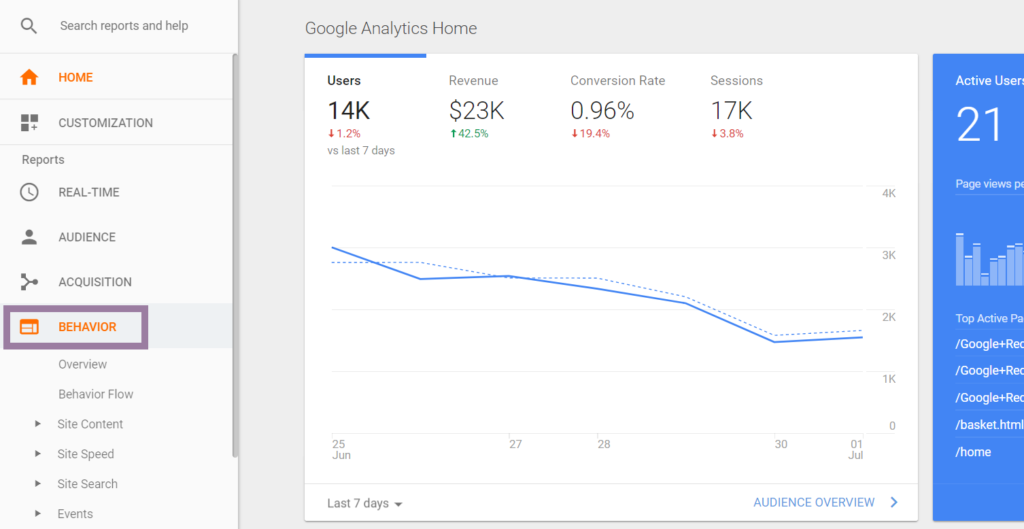
Now head to that gorgeous Behavior section.
I’m going to give you 3 different data points that you should check if nothing else before you redesign that site of yours:
- Behavior Flow
- Site Content
- Goal Completion Location
Behavior Flow and Your Sales Funnel
Let’s jump right into the Behavior Flow of your audience. If you click below the Behavior heading, you’ll see “Behavior Flow”. This is great info that you can use to tailor the funnel you want people to take on your next site.

Here you’ll want to look at a couple of things. First, which pages are directly leading people through the funnel you are intending? Are there any pages that are driving people somewhere you’re not intending?
Based on your answers to those questions, dig into the pages in question and make note of certain characteristics:
- What is the CTA (call to action)?
- Is the messaging clear as to what you want them to do next?
- Are there excessive links?
- Are you confusing your audience?
The answers to these questions will help you either fix the problem or carry over the positive qualities of your pages. That way, when you’re redesigning your website layout and deciding which pages you want, you’ll already know the best funnel flow and CTA options.
Site Content and How Much Money Each Page Is Making
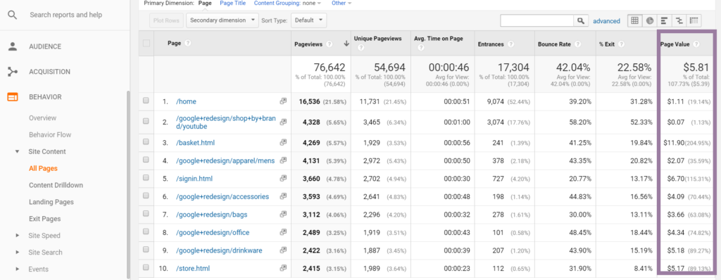
Did you know that you can see literally how much each page of your website is making you? That Page Value there will show you exactly which pages are most profitable (assuming you have goal values or ecommerce set up).
But if you don’t have those things set up? Don’t fear. While goal values and ecommerce sales make the data clear as day, you can still get helpful information from the Behavior > Site Content > All Pages report here.

Look at things like the Bounce Rate–if a page has a high bounce rate, think about if your CTA is clear. If you are funneling people correctly. If there’s actually somewhere else for them to go. As a result, these are all things you can change with your redesign to improve that bounce rate!
Pages with a high Avg Time on Page should get focused on as well. What are they doing right? What kind of content is there? It must be compelling to keep your visitors on the page. List out those qualities and keep them in mind when developing content for your new site.
You might also want to feature those pages more prominently on your new website–especially if you’re engaging customers and the Page Value is high.
Goal Completion Location
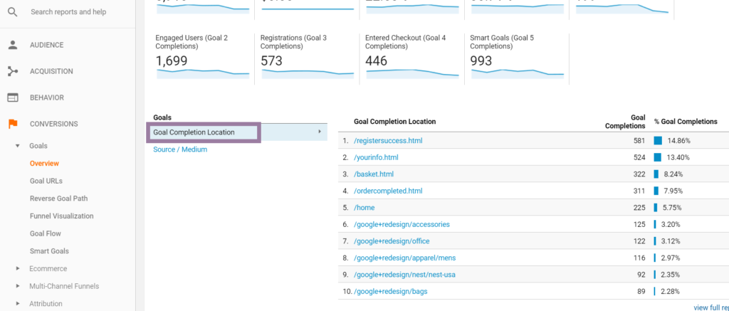
Thirdly (not finally, because I could go on for days at all the data you can look at for your redesign ;)), look at your Goal Completion Location. This is especially helpful if you are using a sidebar or footer for an opt-in form. You can see exactly where people are converting, whether that be a dollar value or an email address.

You’ll want to sort this in both directions–the pages that convert the MOST and the pages that convert the LEAST. Then you can optimize the pages that aren’t converting by taking qualities from the pages that are converting.
There you have it. Three things you can look at right now in your analytics to help guide your website redesign.
Is there anything else you would add? Any questions you have about what to think about when redesigning your site? Send me a message or book a call and we can chat!

